How to Choose Icons for a Healthcare App (UX Guide)
In a consumer app, a confusing icon costs a few seconds of hesitation. In a healthcare app, it can cost a missed medication, a misread result, or a patient who can’t find the button to reach their care team. Medical iconography carries unusually high stakes, which is why “clear and trustworthy” beats “clever and original” every single time.
This guide covers how to choose icons for patient portals, EHR dashboards, telehealth, and wellness apps — and points to the open-source sets and curated packs that already fit the job.
Start with recognizability, not originality
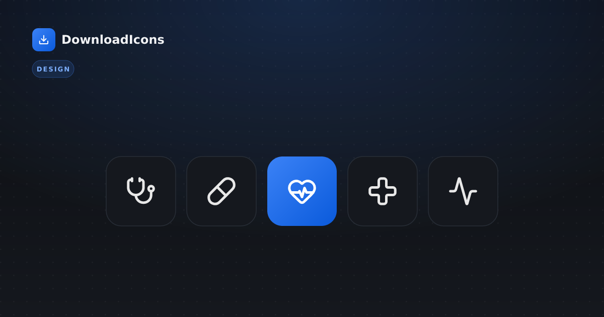
Healthcare users span every age, literacy level, and stress state. Someone checking a worrying lab result is not in a frame of mind to decode a stylized abstraction. So lean on established medical metaphors that decades of signage and software have already taught people:
- A stethoscope for providers/clinical
- A clipboard or file for records
- A pill/capsule for medications, a syringe for vaccines/injections
- A heart or heart-pulse for cardiac/vitals
- A calendar for appointments, a video camera for telehealth visits
The curated healthcare, telemedicine, and wellness packs collect exactly these proven glyphs, already balanced across libraries so the set looks coherent. You can also browse the health category to compare the same concept across all 21 libraries.
Consistency builds trust
Trust in a medical product is partly aesthetic: a coherent, calm interface reads as “this was built carefully.” Mixing icon styles — a thin-line stethoscope next to a chunky filled pill — signals the opposite. Pick one visual language and hold it:
- Outline sets like Lucide, Tabler, and Phosphor (regular weight) give a clean, modern, approachable feel that suits patient-facing apps.
- For dense clinical/EHR tooling, the engineering-precise Carbon or Tabler read well at small sizes inside data tables.
See the minimalist-line style for how a uniform stroke keeps a medical UI calm.
Use color and stroke deliberately
Healthcare UIs lean heavily on semantic color — red for urgent/critical, amber for caution, green for stable/normal. Two rules:
- Never rely on color alone. A colorblind user (≈1 in 12 men) can’t distinguish a red vs green status dot. Back color with a distinct shape or text — an alert triangle and “Critical”, a check and “Normal”. This is both good UX and a WCAG requirement.
- Mind stroke weight. Slightly heavier strokes (≈2px+) hold up better at a glance in high-stress, quick-scan moments and at the small sizes typical of dense tables. Most outline libraries let you adjust stroke right on the icon page before downloading.
Softly rounded corners also matter: they make a clinical interface feel more humane and less sterile, which is why many patient apps favor rounded outline sets.
Respect cultural and regional differences
Medical symbolism isn’t universal. The Red Cross is protected under the Geneva Conventions and is not a generic medical symbol you can freely repurpose — using it commercially can be legally problematic in many jurisdictions. Depending on region, the Red Crescent or Red Crystal is the appropriate emblem, and a neutral medical cross (a plain plus, not the Red Cross emblem) is the safe generic choice. When in doubt, use a generic cross, heart, or “plus” glyph rather than a protected emblem.
Accessibility is non-negotiable here
The stakes make accessibility essential, not optional. For every meaningful icon:
- Label it. Icon-only buttons need an
aria-label(e.g.aria-label="Message your care team"); decorative icons getaria-hidden="true". - Meet contrast. At least 3:1 for UI icons, 4.5:1 for small or critical ones — in light and dark themes.
- Size the target. Interactive icons need a ≥44×44px hit area for users with motor impairments or tremor.
- Don’t encode status in color alone (see above).
Our full icon accessibility guide has copy-paste patterns for each of these.
Test with real users — don’t assume
Icon comprehension is notoriously overestimated by the people who chose the icons. Before shipping:
- Run quick comprehension tests (“what do you think this button does?”) with actual patients and clinicians — their mental models differ.
- Watch for ambiguous metaphors: a “report” could be a chart, a document, or a clipboard; pick the one your users recognize and use it consistently.
- Re-test after any redesign. An icon that tested well in isolation can become ambiguous next to new neighbors.
A starting toolkit
| Need | Where to start |
|---|---|
| Patient portal / telehealth UI | healthcare, telemedicine packs |
| Wellness / fitness app | wellness, fitness packs |
| Clinical / EHR dashboard | Carbon, Tabler |
| Friendly patient-facing app | Phosphor, Lucide |
| Compare one concept everywhere | health category |
The bottom line
Designing for health is a balance of empathy and precision. Choose recognizable metaphors, hold one consistent style, use semantic color with shape and text, respect regional symbolism, and make every icon accessible and well-tested. Do that and your icons quietly do their most important job — helping people get care without friction, exactly when it matters most. Start from the curated healthcare pack or browse the libraries to build your own.