Designing Consistent Icon Sets: The Complete Designer's Guide
Drawing one good icon is easy. Drawing 50 — or 500 — that unmistakably belong to the same family is the real craft. Consistency is what separates a professional icon set from a pile of unrelated vectors, and it’s almost entirely a product of decisions you make before you draw: the grid, the keylines, the stroke, the metaphors. Nail those rules and every new icon practically draws itself.
This is a practical, repeatable system for designing a cohesive set. If you want to study sets that get it right, the minimalist-line and geometric styles — and libraries like Lucide and Tabler — are masterclasses in grid discipline.
1. Start with a grid and keylines
Every consistent set is built on a fixed canvas — most commonly 24×24px (Bootstrap Icons uses 16×16; some use 20 or 32). The grid guarantees icons align and share optical weight when placed side by side.
Inside the canvas, define a safe area and a set of keyline shapes:
- Padding/safe area: keep artwork inside an inner box (e.g. a 20×20 live area on a 24px grid) so nothing touches the edge and icons have consistent breathing room.
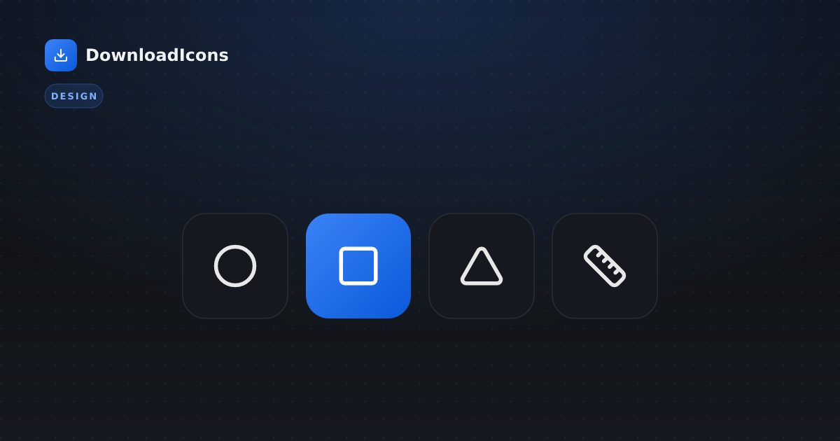
- Keyline shapes: a circle, a square, and a portrait/landscape rectangle of agreed sizes. Snap each new icon to whichever keyline fits its silhouette. This is the trick that makes a phone, a heart, and a gear all feel the same size even though their shapes differ.
24 × 24 canvas
┌───────────────────┐
│  ┌─────────────┐  │  ← ~2px padding
│  │  live area  │  │  ← keyline shapes live here
│  └─────────────┘  │
└───────────────────┘
2. Define your visual language (write the rules down)
Before drawing the catalogue, lock the parameters every icon must obey. Put them in a one-page spec so the set stays coherent even across multiple designers:
| Parameter | Decide once | Example |
|---|---|---|
| Stroke weight | One value, everywhere | 2px on a 24 grid |
| Corner radius | Outer + inner radii | 2px outer, sharp inner |
| Line caps / joins | Butt, round, or square | round caps + round joins |
| Terminal style | How open paths end | rounded |
| Detail level | Minimal vs illustrative | minimal, no interior noise |
| Fill vs stroke | Outline, solid, or both | outline primary, solid for states |
The single biggest consistency lever is stroke weight: one weight across the whole set. The moment some icons are 1.5px and others 2px, the family falls apart. (This is also why mixing two libraries with different strokes looks “off” — see best free icon libraries.)
3. Optical balancing: trust your eye over the math
Geometry alone lies. A circle and a square of identical pixel dimensions do not look the same size — the circle reads smaller because it encloses less area. So you deliberately over-size certain shapes to make them feel equal:
- Circles and diamonds usually extend slightly beyond the square keyline.
- Triangles get nudged to balance their visual center of mass (which isn’t their geometric center).
- Thin diagonal strokes can look lighter than verticals/horizontals of the same width and may need a hair more weight.
Always evaluate icons at their real size (16–24px), not zoomed to 800%. What’s balanced at 10× can be mud at 1×.
4. Keep metaphors consistent
A set is a visual vocabulary, so the same idea must look the same everywhere:
- If a “document” has a folded top-right corner, every document-derived icon (file, report, invoice) shares that fold.
- If “add” is a plus in the top-right, “remove” is a minus in the same spot — not a trash can in one place and a minus in another.
- Reuse sub-components: the same magnifier for every “search/find/zoom”, the same gear for every “settings/config”.
Think of it like a typeface: every glyph is different, but they all share the same DNA — the same terminals, the same rhythm, the same contrast.
5. Name and organize systematically
Consistency isn’t only visual — developers feel it in the API. Adopt a predictable naming scheme and stick to it:
- Lowercase, hyphenated, noun-first:
arrow-right,chevron-down,file-text. - Group variants with suffixes:
bell,bell-off;eye,eye-off;folder,folder-open. - Avoid synonyms drifting in (
trashvsdeletevsbin— pick one).
Browse how mature libraries name things in the interface and arrows categories; borrowing their conventions makes your set instantly familiar to developers.
6. Export clean SVG
A beautiful icon with messy code is a maintenance tax on every developer who touches it. Before shipping each icon:
- Flatten unnecessary groups and remove editor metadata, hidden layers, and IDs.
- Round coordinates to sensible precision (2 decimals is plenty) to shrink the file.
- Use
currentColorfor fills/strokes so the icon inherits text color and adapts to themes for free. - Keep a consistent attribute order and a single, predictable
viewBox(0 0 24 24). - Run everything through an SVGO-style optimizer.
<svg xmlns="http://www.w3.org/2000/svg" width="24" height="24"
     viewBox="0 0 24 24" fill="none" stroke="currentColor"
     stroke-width="2" stroke-linecap="round" stroke-linejoin="round">
  <!-- a single, clean path set -->
</svg>
Every icon in our directory is already optimized this way — a good reference for what “clean” output looks like.
7. Test the set as a system
Individual icons can be perfect and the set still fail. Validate the whole family:
- Grid view at real size. Lay all icons out at 16, 20, and 24px. Outliers in weight or size jump out immediately.
- In context. Drop them into actual buttons, nav rails, and tables — the filled-solid style exists precisely because outline icons can disappear at tiny sizes, so test the sizes you’ll really ship.
- Light and dark. With
currentColor, both should just work — but check contrast. - New-icon test. Hand your spec to someone else and have them draw a new icon. If it slots in seamlessly, your rules are tight. If it doesn’t, the spec has a gap.
Don’t reinvent the wheel
Designing a full set from scratch is months of work, and for most products it’s unnecessary. Before committing, ask whether an existing open-source family already nails your style — there are 21 of them spanning every visual language, from pixel-art to duotone to neumorphic. Often the right move is to adopt a consistent set and only draw the handful of bespoke icons your product genuinely needs — matching them to the host set’s grid and stroke using the principles above.
The bottom line
A cohesive icon set is engineered, not stumbled into: a fixed grid and keylines, one stroke weight, optically-balanced shapes, shared metaphors, systematic names, and clean SVG export. Users rarely notice great iconography consciously — they just perceive the product as more polished and trustworthy. That perception is the whole payoff. Study how the pros do it across the styles and libraries, and your own set will be the better for it.