The Best Icons for SaaS Dashboards (2026 Guide)
Dashboard UI is the hardest place to get icons right. You’re cramming navigation, metrics, tables, filters, and status indicators into a single screen, often at 16–20px, and every glyph competes for attention. The wrong icon set turns a dashboard into visual noise; the right one makes a dense interface feel calm and scannable. This guide covers which libraries and styles hold up in data-heavy SaaS products, the icons every dashboard needs, and the curated packs that get you started fast.
You can assemble any of these into a single export using the kit builder, and browse ready-made sets on the packs page.
What makes an icon set “dashboard-grade”
Dashboards have requirements that don’t matter much on a marketing site:
- Legibility at small sizes. Icons live at 16–20px in nav rails, table cells, and buttons. Ultra-thin strokes blur or vanish; the set needs enough weight to read at a glance.
- A uniform stroke weight. With dozens of icons on screen, any inconsistency in stroke jumps out and makes the UI feel sloppy. One weight, everywhere.
- Broad coverage. You’ll need interface, data, file, device, and settings concepts from a single family so you’re never style-hopping to fill a gap.
- Restraint. Dashboard icons should recede and support the data, not shout. Decorative, illustrative styles fight the numbers.
Those four constraints point clearly toward precise outline sets — which is why the libraries below dominate real products.
The top libraries for dashboards
| Library | Why it works for dashboards | License |
|---|---|---|
| Tabler | Grid-precise, thousands of UI/data/devops icons, reads great at 16px | MIT |
| Lucide | Clean, neutral, broad coverage, huge framework support | ISC |
| Carbon | Built by IBM for enterprise data products; technical and dense-friendly | Apache 2.0 |
| Heroicons | Outline + solid pair for active states; perfect on Tailwind | MIT |
| Phosphor | Multiple weights from one family for hierarchy | MIT |
Tabler: the dashboard workhorse
Tabler is grid-discipline taken to an extreme — every stroke pixel-aligned, every curve a single radius — and it spans thousands of icons covering interface, devops, charts, and data concepts. That coverage means you rarely have to leave the family, which keeps a dashboard coherent. It pairs naturally with the admin-dashboard and analytics packs.
Carbon: enterprise data UI
Carbon was designed by IBM specifically for data-dense enterprise software, so it reads as engineering-precise and holds up inside tables and toolbars. If your product is analytical and serious, it’s a strong fit and Apache 2.0 licensed.
Lucide and Heroicons: the safe modern defaults
Lucide is the neutral default that works almost anywhere and ships first-party packages for every major framework. Heroicons is the obvious pick on a Tailwind stack, and its matched outline/solid variants are tailor-made for dashboard nav — outline for inactive items, solid for the selected one. See using SVG icons in Tailwind CSS for styling them.
The icons every SaaS dashboard needs
Most dashboards draw from the same core vocabulary. Stocking these up front from one library saves you from piecemeal gaps later:
- Navigation: dashboard/home, search, settings, user/profile, menu, bell (notifications) — browse the navigation and interface categories.
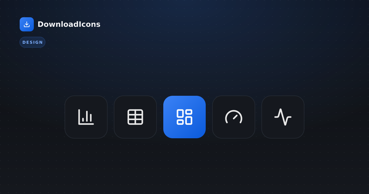
- Data & metrics: bar chart, line chart, table, gauge, trending up/down, activity — see the charts category.
- Actions: add/plus, edit, delete, filter, download, share, refresh — the tools category covers most.
- Status: check, alert triangle, info, x/error, clock/pending — pair these with text, never color alone.
- Account & billing: card, user, settings, security (shield, lock).
Pulling these from a single set like Tabler or Lucide guarantees they share a stroke and grid.
Style choices that keep dashboards calm
Style matters as much as the library. A few rules keep a busy screen readable:
- Use a minimalist-line or geometric style for the bulk of the UI — restrained and uniform.
- Reserve filled-solid for active/selected states, so the current nav item or active filter stands out without adding a second library.
- Keep brand color sparing. Most icons should inherit neutral text color via
currentColor; use your accent color only for primary actions and active states. - Avoid illustrative or duotone styles in dense chrome — save those for empty states and onboarding, where they add warmth without competing with data.
For the full reasoning on matching style to product, see how to choose an icon style for your brand.
Status indicators: get these right
Status is where dashboards most often fail accessibility. A red dot and a green dot are identical to a colorblind user and to a screen reader. Always back status with shape and text, not color alone — an alert triangle and “Failed”, a check and “Healthy”. This is both good UX and a WCAG requirement; the patterns are in the icon accessibility guide. Distinct status shapes (the shapes category is handy) make state legible to everyone, in light and dark themes alike.
Performance: don’t ship the whole library
Dashboards render a lot of icons, often in long, virtualized tables, so delivery matters:
- Import only what you use. Per-icon imports (e.g.
import { ChartBar } from 'lucide-react') tree-shake away the rest — never wildcard-import a whole set. - Use a sprite for repeated icons. When the same status or action icon appears in hundreds of rows, an SVG sprite defines it once instead of duplicating markup. See how to add icons to a React app for both patterns.
- Skip icon fonts. Loading an entire font for a handful of glyphs is pure overhead — SVG vs PNG vs icon fonts explains why inline SVG wins.
Start from a curated pack
Rather than hand-picking dozens of icons, start from a pack already balanced for the job and add to it:
- admin-dashboard and admin — core nav, data, and management icons.
- analytics and dashboard — charts, metrics, and reporting glyphs.
- saas — a broad product UI starter set.
- settings-menu and user-profile — account and configuration screens.
- fintech — for finance and billing-heavy dashboards.
Each pack exports as SVG or framework components in one download, with an attribution file covering every source.
Frequently asked questions
What’s the single best icon library for a dashboard? Tabler for its grid precision and huge coverage, or Lucide as the neutral default. On Tailwind, Heroicons. For enterprise data UI, Carbon.
What size should dashboard icons be? Most live at 16–20px in nav and tables; 24px for primary buttons. Test at the real size, not zoomed in — thin strokes that look fine at 100px can blur at 16px.
How do I handle active vs. inactive nav states? Use an outline icon for inactive items and the matching solid version for the active one. Heroicons ships both, so they stay consistent.
Can I mix libraries in one dashboard? Prefer not to — different stroke weights clash. If you must, match weights and browse by category to find compatible glyphs, or start from a curated pack.
The bottom line
Dashboard icons succeed by getting out of the way: a precise, uniform outline set (Tabler, Lucide, or Carbon) at small sizes, filled variants only for active states, status backed by shape and text, and lean per-icon delivery. Start from a curated pack, keep one stroke weight throughout, and browse 21 libraries to fill any gaps — your dashboard will feel calm, scannable, and intentional.